


 J.W.M Turner


 Josef Albers, one color as two
Josef Albers, two color as one

1. value contrast


2. complementary reaction
 3. subtraction
 4. Josef Albers, Bezold Effect
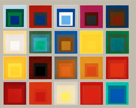
In studying the basic attributes of color and how to mix and match colors, we have looked at color as an isolated phenomena. Now we will place it back into the world, and look at how context affects the appearance of color.
If you remember from the images I shared with you the first week, the Law of Simultaneous Contrast was conceived by French Chemist M.E. Chevereul in the late nineteenth century. He stated: "In the case where the eye sees at the same time two contiguous colors, they will appear as dissimilar as possible, both in their optical composition and in the height of their tone." This theory was widely influential amongst nineteenth European painters, such as Van Gogh, Monet, Turner and more. It was the very basis for the Divisionist, or Pointillist movement (i.e.; Seurat). In the mid-twentieth century, Bauhaus artist, as well as Black Mountain and Yale legendary teacher Josef Albers made it the center of his approach to color, in his own work and his teaching. He was endlessly fascinated with how color is relative, how much appearance can fool the eye, and the instability of the perception of color. Albers broke down simultaneous contrast into three types, or reasons for the effect. These are Value Contrast, Complementary Reaction, and Theory of Subtraction. We will utilize these in this assignement.
Your assignment is to create a total of five in a series of simultaneous contrast exercises designed to help you understand and internalize the principles.
One panel should demonstrate value contrast and should be comprised of two very different value surrounds each with the same color center.
The next panel should demonstrate complementary reaction and should utilize a color and a neutral gray surround with the center squares being the complement of the color surround.
Next, demonstrate the principle of subtraction by using a neutral gray and a color surround, and a center chip that is related to the colored surround (secondary to primary, secondary to tertiary).
Lastly, create one page with two surrounds that makes one color appear as two, and then a fifth page that makes two colors appear as one, also using two surrounds.
I recommend doing these exercises in numerical order, as they are increasingly difficult, and 4 and 5 require complete understanding of 1-3. For all five, you should replicate the Albers format: please use a 1" square in a 4" surround. Please utilize the information above (1-4) and the aforementioned reading. These visual principles will guide you in 'pushing' colors to alter appearance.
You may not use any of the color combinations in these examples.
Please remember that the colors on the screen become altered from original prints.
Project due Monday, February 14.
No comments:
Post a Comment