

The idea is based on the fact that Westerners often complain that Tokyo has no street names and that you can’t find your way around without a guide who innately knows the logic of his own city. I always thought that was such a superb form of local resistance—no key! So I felt it would be interesting to start naming the streets of Tokyo with names from Western culture and society, to help us around. I am sure the people of Tokyo will like it too! |
| |
| Naming Tokyo |
| June 5 - September 14, 2003. Palais de Tokyo, Paris, as part of the exhibition GNS: Global Navigation System. Curated by Nicolas Bourriaud. |


Moscow subway Map
 MIT / Climate Interactive
http://www.climateinteractive.org/simulations/mits-greenhouse-gas-simulator


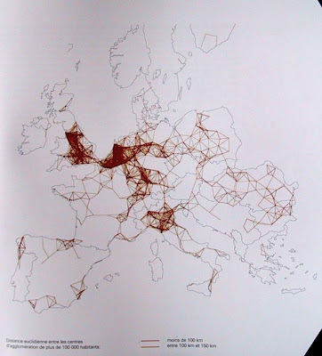
 Straight-line distance between European cities with populations of 100,000 or more, Denise Pumain, 2000
PROJECT 8: Use color as a major element in cartography, charting, or indexing to map any sort of geography (including psycho geography or piece of knowledge, to clarify and/or denote a set of complex information. Your diagram or chart should have an investigative aspect.
This is a two week project (15 hours outside of class expected). Any media. Project due MONDAY, APRIL 20.
*note: we are still departing from our customary schedule, ending on a Wednesday.*
The next project period after this one will be our final project. This will be a two and a half week self-intitiated color-oriented project. So please begin to consider what you'd like to do
| If we were able to take as the finest allegory of simulation the Borges tale where the cartographers of the Empire draw up a map so detailed that it ends up exactly covering the territory (but where the decline of the Empire sees this map become frayed and finally ruined, a few shreds still discernible in the deserts — the metaphysical beauty of this ruined abstraction, bearing witness to an Imperial pride and rotting like a carcass, returning to the substance of the soil, rather as an aging double ends up being confused with the real thing) — then this fable has come full circle for us, and now has nothing but the discrete charm of second-order simulacra. Abstraction today is no longer that of the map, the double, the mirror or the concept. Simulation is no longer that of a territory, a referential being or substance. It is the generation of models of a real without origin or reality: a hyperreal. The territory no longer precedes the map, nor survives it. Henceforth, it is the map that precedes the territory — PRECESSION OF SIMULACRA — it is the map that engenders the territory and if we were to revive the fable today, it would be the territory whose shreds are slowly rotting across the map. It is the real, and not the map, whose vestiges subsist here and there, in the deserts which are no longer those of the Empire but our own: The desert of the real itself. Jean Baudrillard, "The Precession of Simulacra" ************************************************************************************ Yale professor Edward Tufte takes dull data and turns it into magical and meaningful pictures. Forget those clunky bars and pizza slices you were taught in school, Tufte produces such inventive and even decorative graphs it's enough to have you weeping over your squared paper. And each one helps us understand the world a bit better, or alerts us to the crimes that can be committed when the people with the numbers seek to confuse the have-nots. Tufte exposes the hidden dangers of misrepresented numbers: how graphs can kill. In his book Visual Explanations he shows how inept graphing of data about the space shuttle paved the way for the Challenger disaster. Throw out the engineer's pretty slides and substitute Tufte's simple curve, and mental warning lights flash. It's not rocket science, after all. -Paul May, "Why I Love...Edward Tufte", The Guardian, 11/8/04 ************************************************************************************ On Otto Neurath (from C. R. Shalizi, U. Mich) Austrian sociologist, political economist and anti-philosopher; possibly the most unorthodox Marxist ever. Having developed some theories about a moneyless ``economy in kind'' before the war, he was assigned by the Austrian government to work in what was, effectively, the planning ministry during the Great War. This led to his working for the governments of Bavaria and Saxony towards socializing their economies after the war, a project he attacked with great enthusiasm, continuing through two coups that brought to power two different ``Soviet Republics''. (He had cleverly arranged to be hired as a civil servant...) Eventually the central German government restored order and arrested him as a collaborator in high treason, but they had to let him go when it became evident that he didn't care about anything except his work, and had barely noticed the changes in government. (The intervention of Max Weber and various Austrian officials helped.) When he got back to Vienna, we became involved in a project which evolved into the Social and Economic Museum, which tried to convey complicated social and economic relations to the largely uneducated Viennese public. (The didn't call it Red Vienna for nothing.) This led to some very interesting work on graphic design, visual education and the visual display of quantitative information, indeed, a whole Vienna Method for such displays, also called ISOTYPE. |


1 comment:
Found this video. It Is a video of a journalist turned designer (and actually the same man who created the "left right" political graph previously posted by pamela) who displays a bunch of interesting data visualizations. this is a great reference for this project
http://www.stumbleupon.com/su/90coht/www.disinfo.com/2010/11/facebook-can-predict-your-break-up/
Post a Comment